




A companion for every stage
nurture+ is an iOS app for the months before, during and after pregnancy. It keeps a pregnancy’s logs and health records together, and turns them into a report for appointments.
I’ll start with the research and the moodboards, then get into the directions we tried and dropped before the final screens. Next to the weekly baby updates, the app keeps the parent’s own logs and health records together.
- Product designer: research, user flows, design system and UI design
- Four weeks, from App Store reviews to dev-ready handoff
nurture+ is an iOS app for the months before, during and after pregnancy. This is how its design came together.
Project
- Client
- nurture+
- Platform
- iOS
- Category
- Maternal health
- Role
- Product designer
What’s in it
- Weekly updates
- Food and photo logging
- Supplements
- Caffeine
- Health records
- Symptoms
- Stage changes
- Ask Nurture
- Appointment reports
- Privacy and export
My part
- Research
- User flows
- Design system
- UI design
How the work went
Here’s roughly how the work went. Four steps, and most of the back and forth happened during iterations.
I started by reading what people say about pregnancy apps and pulling four of them apart screen by screen. Then came four moodboards, three home directions and a few rounds on the nutrient module.
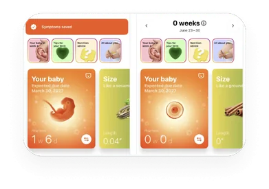
Competitor Analysis
- App Store reviews
- Competitor matrix
- Teardown of four apps
Narrow down features
- Stages
- Care profile
- Moodboards
Design + Iterations
- Three home directions
- Iteration rounds
- Review on 19 Sep
Dev-ready assets delivered
- 152 screens and states
- Component library
- Handoff notes
Nine apps, side by side
Then I lined the apps up side by side. Nine of them, using Screensdesign as my primary research tool.
The pregnancy apps all do weekly baby updates. None of them log food against targets or keep health records, and MyFitnessPal, the one food tracker in the list, isn’t a pregnancy app at all.
| App | Weekly baby updates | Kick counter or timer | Parent forum | Nutrient targets | Vitamins & meds | Symptom log | Health records | Visit report | Answers with sources | Postnatal support |
|---|---|---|---|---|---|---|---|---|---|---|
| Pregnancy apps | ||||||||||
| Pregnancy+ | ||||||||||
| BabyCenter | ||||||||||
| What to Expect | ||||||||||
| Ovia | ||||||||||
| Flo | ||||||||||
| Sprout | ||||||||||
| amma | ||||||||||
| Nutrition apps | ||||||||||
| MyFitnessPal | ||||||||||
| Cronometer | ||||||||||
| nurture+ | ||||||||||
nurture+ doesn’t have a kick counter or a community.
What reviewers kept saying
I started with App Store reviews: the most recent ones for each pregnancy app in the competitor analysis.
About 1 in 7 praise the weekly baby updates, so I chose that feature to stay. The low ratings kept coming back to paywalls, onboarding that loses data and advice that feels generic.
- 1 in 7Baby updatesReviews that praise the week-by-week baby content.
- 28.0%Paywalls and adsThe most common complaint in 1 to 3 star reviews.
- 27.5%Logging and lost dataMany describe months or years of logs gone after an update.
- 21.8%Generic or wrongContent that didn’t fit their week, or was out of date.
What people wrote
- Highly recommend
I love how the app tells me what is happening week by week and I get to “see” my baby.
Pregnancy+ · App Store - Everything is an upsell
Or a subscription, or asking for more data. I immediately got emails from third party companies.
What to Expect · App Store - Lost my data twice
Twice now it’s updated & my data is just gone.
Ovia · App Store - Sorta helpful
I think some of the info is just basic, outdated, or even false. Can’t really trust it.
Ovia · App Store
Forty weeks, forty illustrations
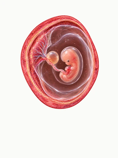
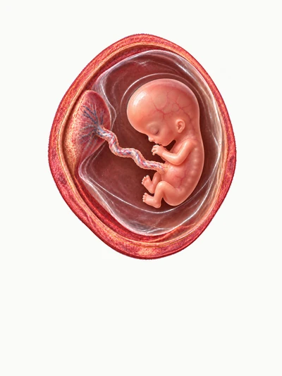
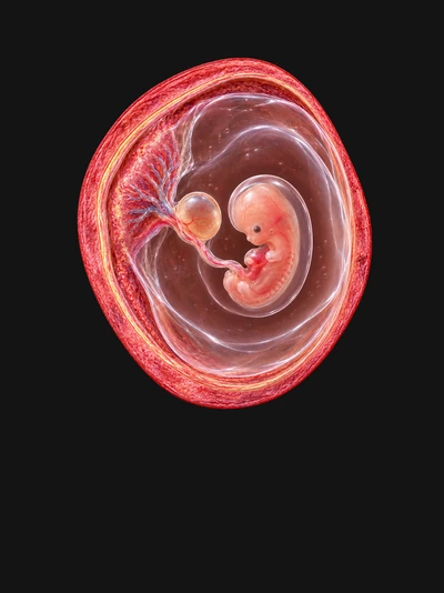
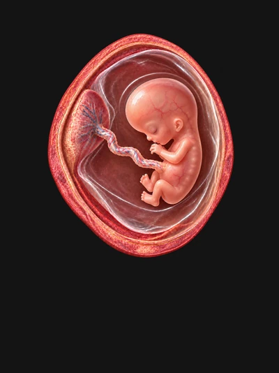
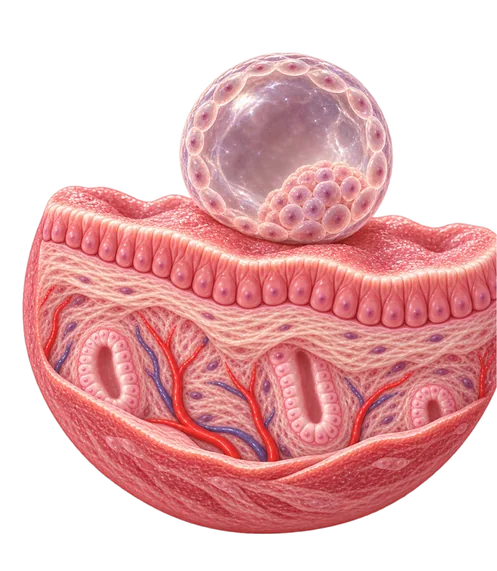
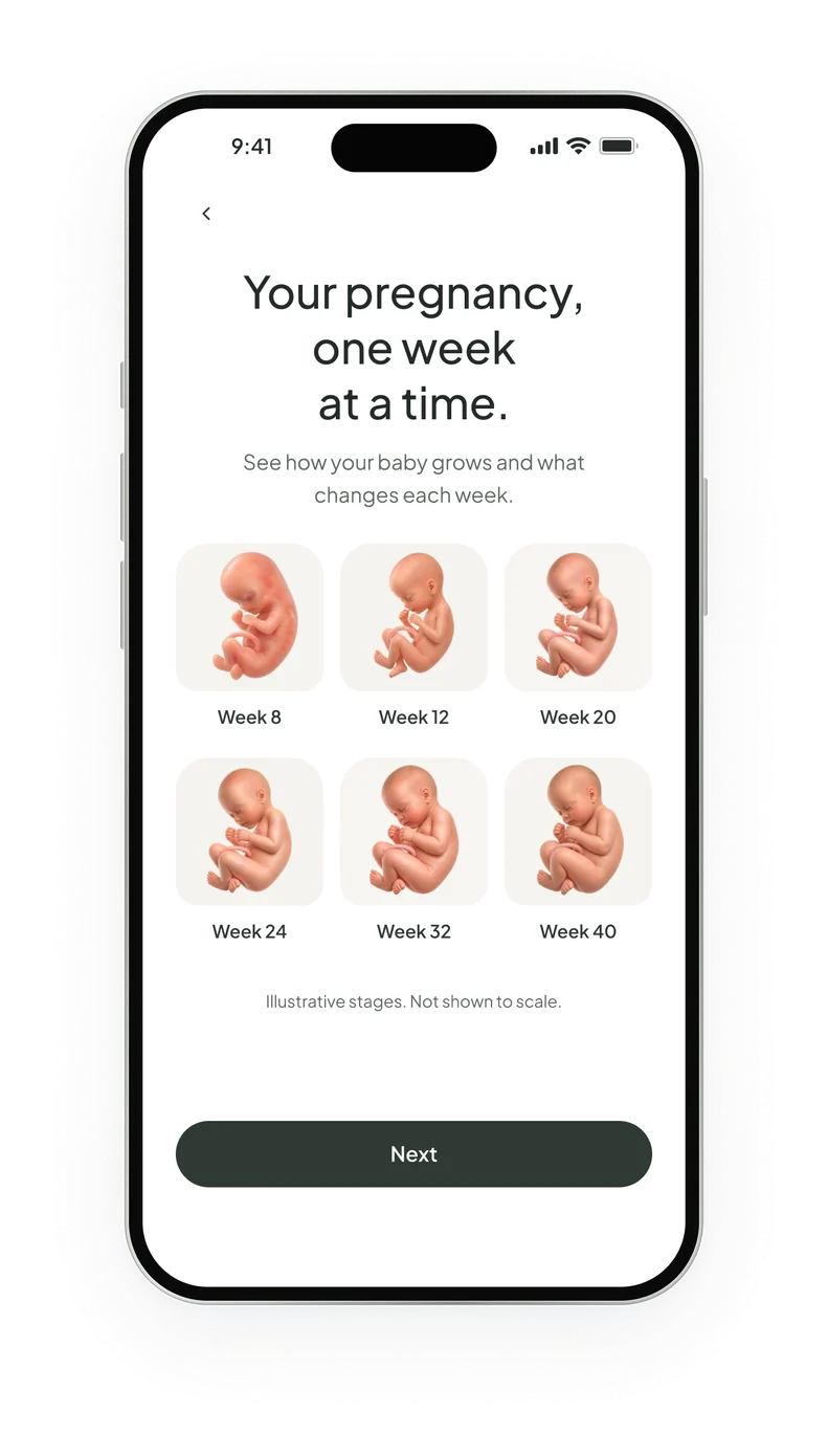
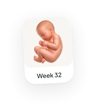
I researched every week of the pregnancy, and all 40 weeks have their own anatomical illustration.
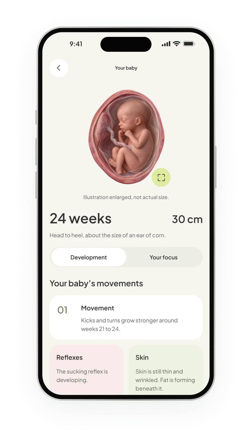
They follow the anatomy week by week: the lining before conception, then implantation, the embryo, the fetus, and the turn head-down near the end. The sizes and development notes in the app come from the NHS and ACOG week-by-week guides. This was to help users connect with the growth of their baby throughout the pregnancy.
 Week 01
 Week 02
 Week 03Blastocyst
 Week 04Implantation
 Week 05Embryo
 Week 06
 Week 07
 Week 08
 Week 09
 Week 10
 Week 11Fetus
 Week 12
 Week 13
 Week 14
 Week 15
 Week 16
 Week 17
 Week 18
 Week 19
 Week 20
 Week 21
 Week 22
 Week 23
 Week 24
 Week 25
 Week 26
 Week 27
 Week 28
 Week 29
 Week 30
 Week 31Head-down
 Week 32
 Week 33
 Week 34
 Week 35
 Week 36
 Week 37
 Week 38
 Week 39
 Week 40
Sources for the sizes and development notes in the app: NHS week-by-week guide and ACOG, How your fetus grows during pregnancy.
Four moodboards
I started with four moodboards. Every one of them tried a different but cohesive feeling for the app.
The nature board won with Terry. One of my notes on it says “Everything in nature was once a baby”, and its greens and overhead food shots are still all over the app.
 Womanhood, community
Soft
- Warm, delicate, nurture
- Muted safe color scheme
- Circular, welcoming
 KeptVitamins
Nature
- Nature + numerics
- Organic rounded shapes
- Color inspiration
 Baby sizes as fruit
Playful shapes
- Lots of organic shapes
- Candy-like elements
- Fresh color
 Funny baby drawings
Lighthearted
- Drawings remind of childhood
- Cute messages, feels approachable
- Casual, light
Three home directions
The home screen went through three directions. I tried to make all of them prioritise the baby and nutrition.
I usually start with the key screens instead of onboarding, to understand which tonality to set for the rest of the app. This way we settle on a direction sooner and go through fewer iterations at the end. The goal is to get to the rejected ideas faster.
A led with a big week card, B squeezed the week into one row, and C went big on the baby illustration. After review calls the client picked a fourth direction, which combines elements of all three with a completely new petal dial for nutrition.
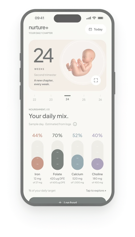
Direction AThe week card first, then four nutrient capsules in percent.
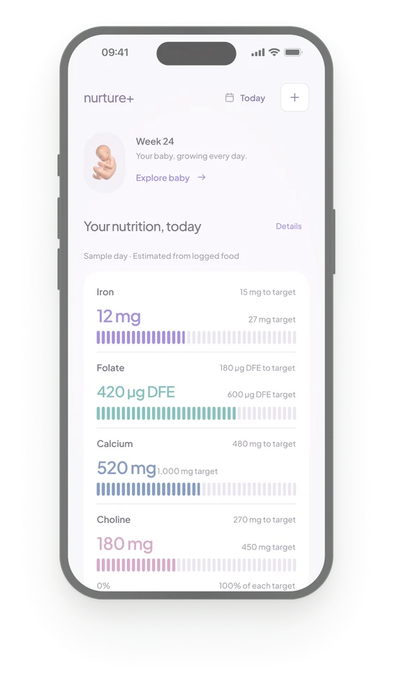
Direction BThe week as one row, then four bars with their targets.
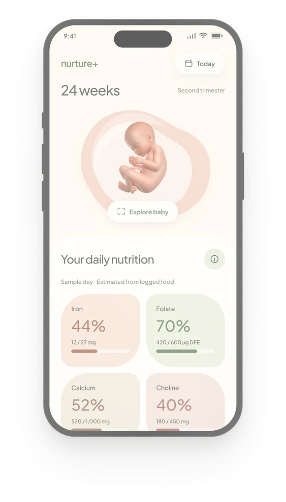
Direction CA large baby illustration, then four tinted nutrient tiles.
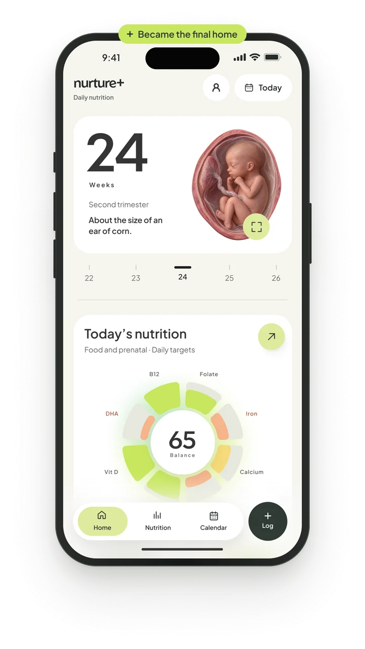
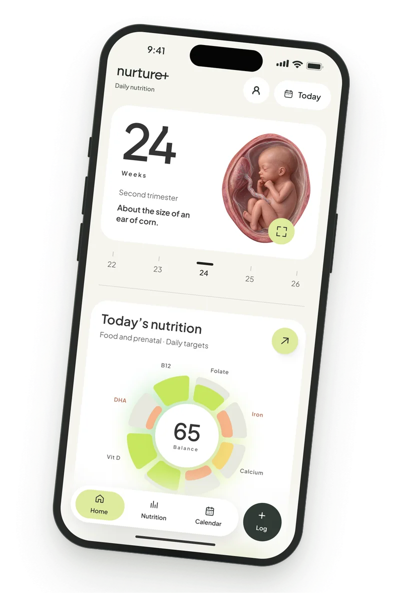
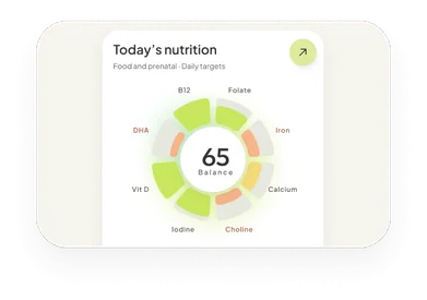
Final homeOne dial with eight nutrients under the week card.
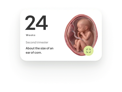
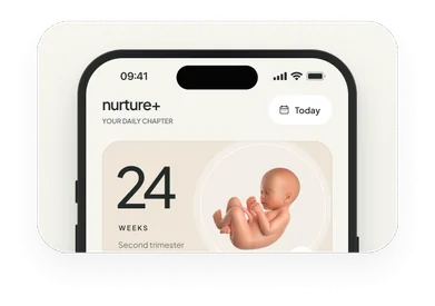
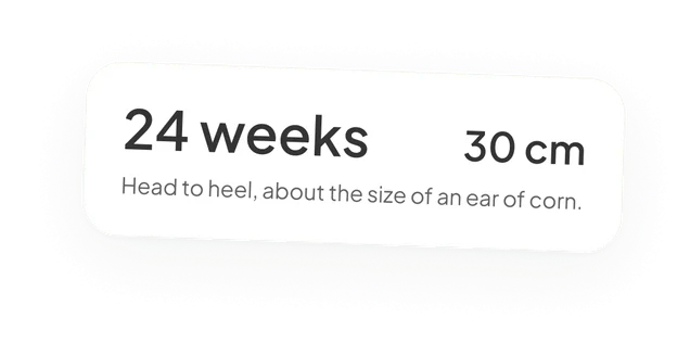
Kept from AThe same 24 weeks card that opens direction A.
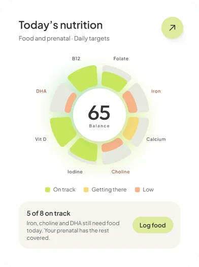
One dialFour capsules became eight petals around one score.
Four rounds on nutrition
The nutrition module itself took four rounds. We wanted a unique and easy way for moms to scan their deficiencies.
It started as progress rows, one per nutrient, but that was too predictable. Then I tried a ring with a carousel of all nutrients, a ladder with eight bars split between food and prenatal, and finally the petal dial on the home screen, with one balance score in the middle.
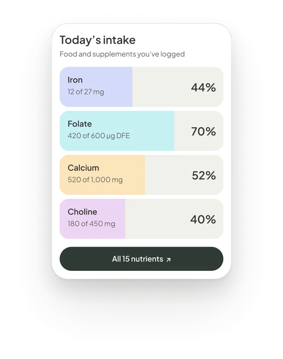
Progress barsRows, four with amounts
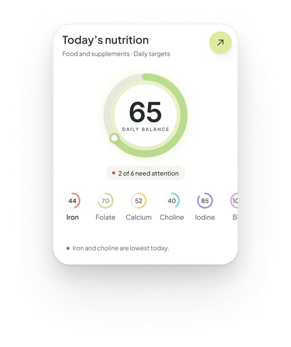
RingsRings around one balance score
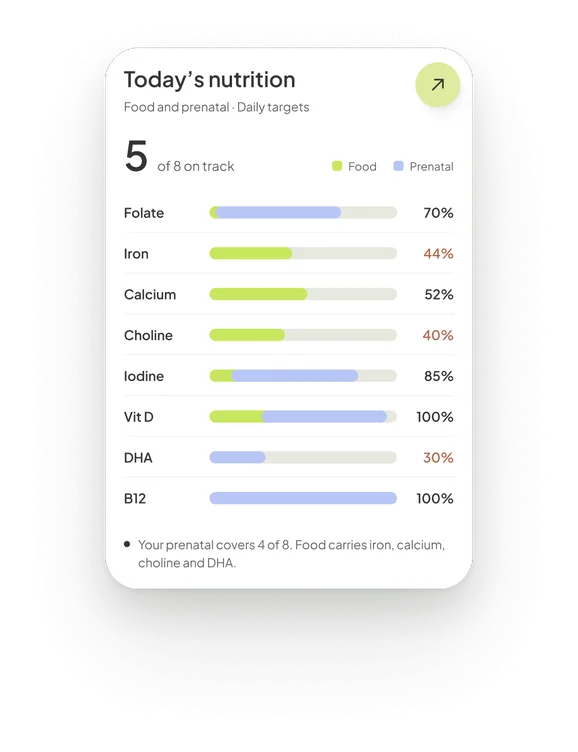
Progress bars but detailedBars split between food and prenatal
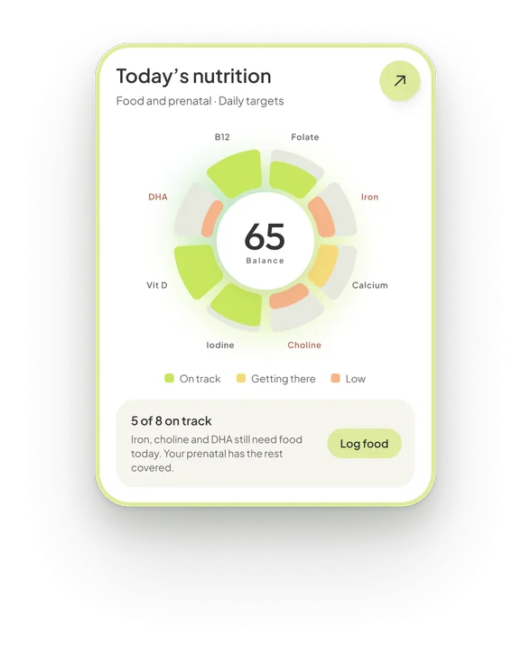
Petal circular dialPetal dial in the final home screen
Onboarding
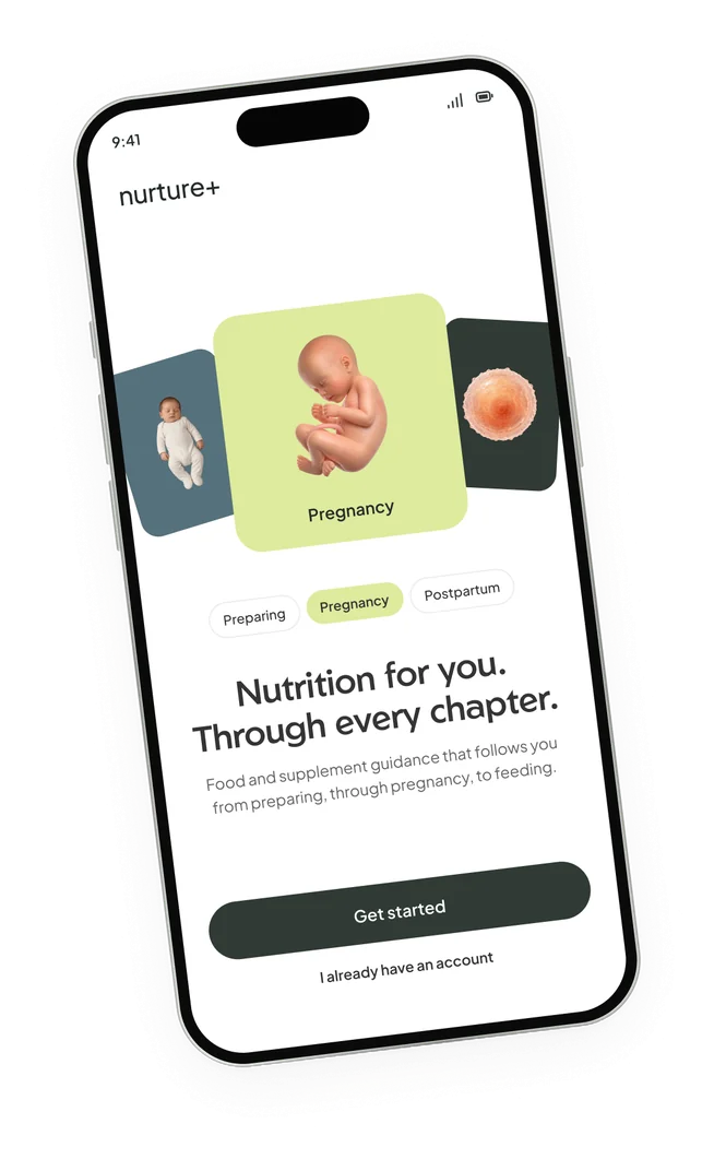
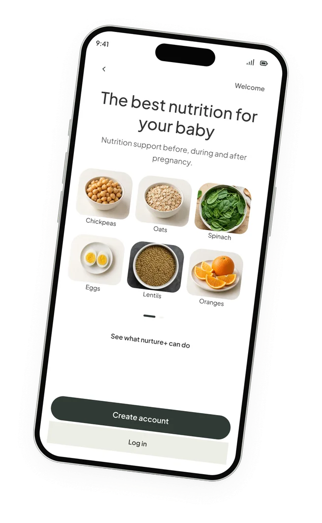
The setup screens give a glimpse of why nurture+ is more than just a pregnancy tracking app.
The idea was to make the app nutrition and baby-focused: align the growth of the baby with helping mothers and mothers-to-be nourish their bodies, and feel a sense of connection with the baby each passing week.
A page for every week
Every week has its own page. It shows the baby’s size and development, and cites ACOG or the NHS.
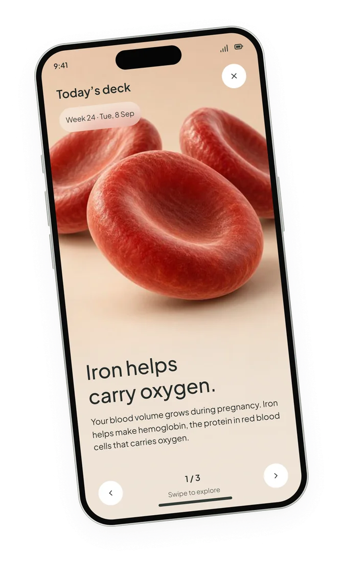
I also added three short fact cards that open each week from Home. They can be reopened later from “This week”, so nothing is lost on a skipped day.
Layered logging
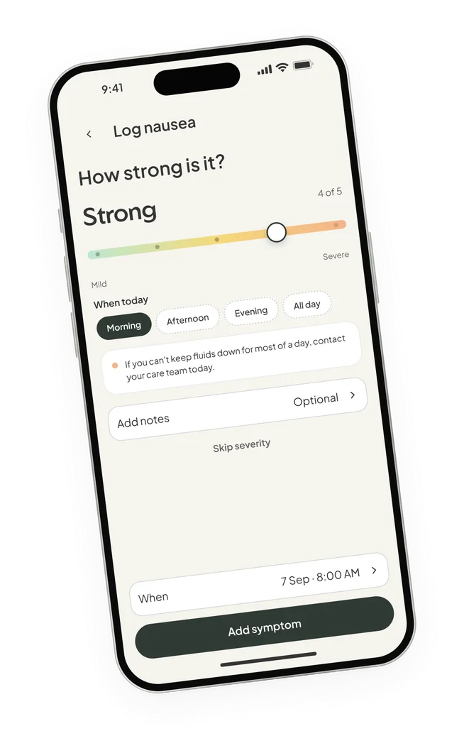
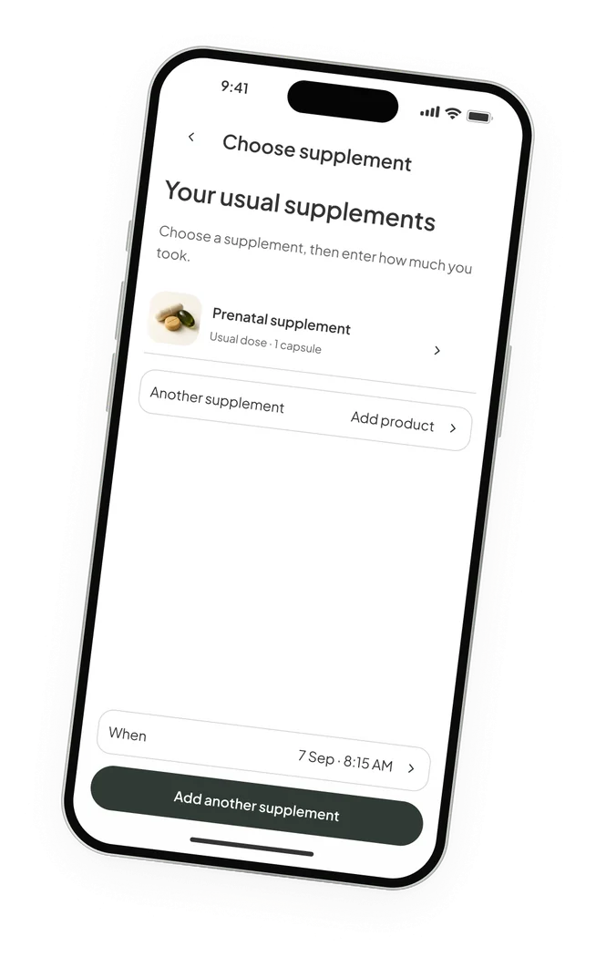
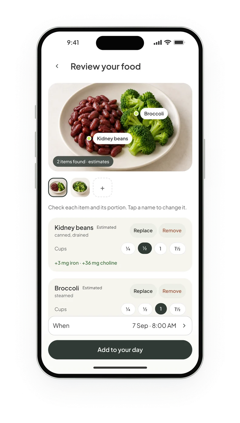
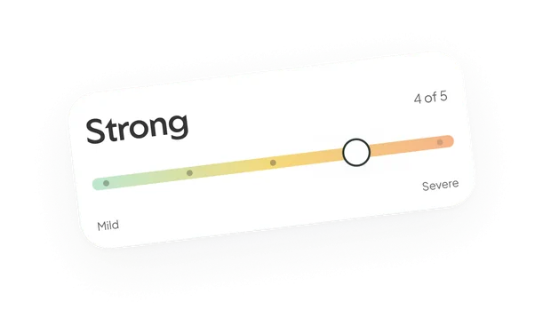
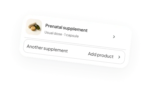
I layered the logging: food, caffeine, supplements and health records, to give an overall picture of nourishing the body and the baby.
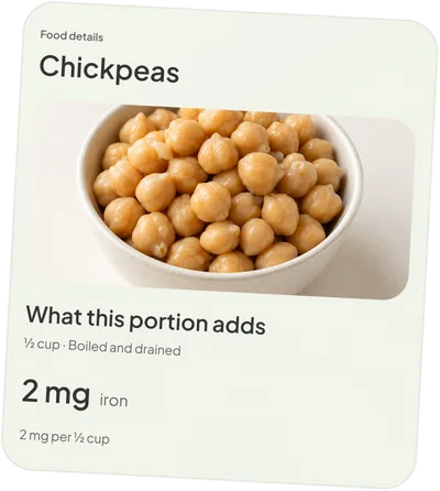
Food can also start from a photo. The app finds what’s on the plate, like the kidney beans and broccoli here, and asks you to check each item and its portion before saving.
History and reports
Logs can be viewed on a calendar: every log and record from that day, in time order.
Before an appointment, the app turns a date range into a report. You choose what goes in, medicines stay out unless you tick them, and it’s shared as a PDF.
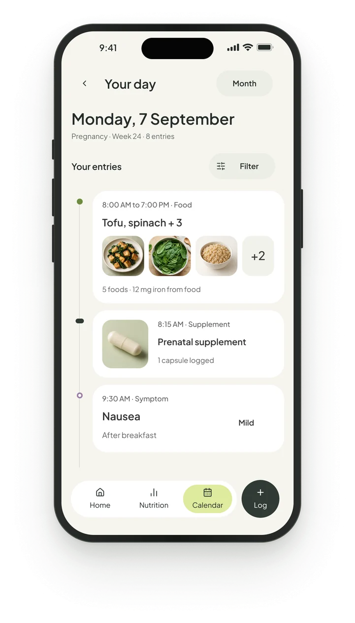
Your day8 entries on Monday, 7 September, in time order.
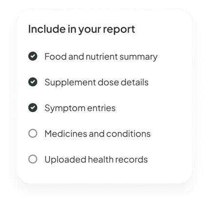
Appointment reportMedicines stay out unless ticked.
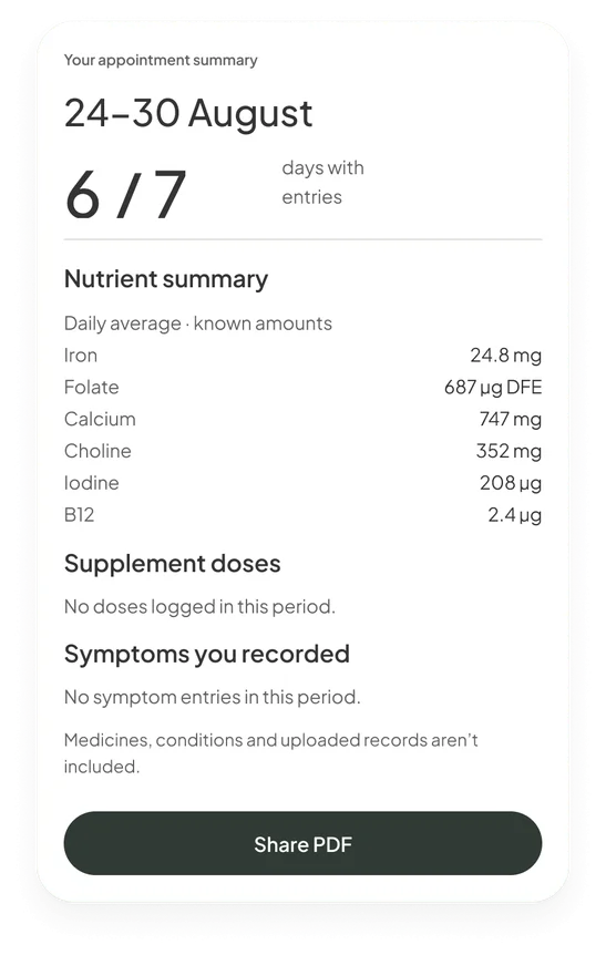
Report readyThe week’s nutrient averages, shared as a PDF.
Ask Nurture
All answers show their sources. Each one lists the logs and the NIH fact sheet it drew on.
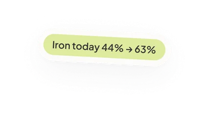
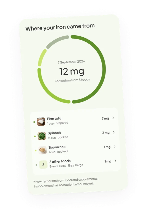
The iron answer starts from the 12 mg logged that day, which adds to the personalised layer of the app. For bleeding, it tells you to contact your care team and puts the steps and a call button right there. The idea is to allow maximum access to care, information and tools.
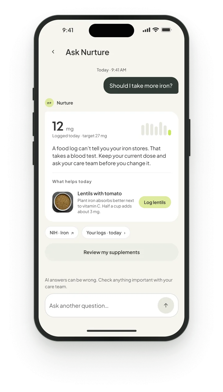
Should I take more iron?The answer starts from the 12 mg logged today.
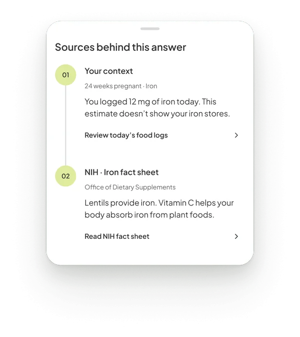
Sources behind this answerYour 12 mg today, then the NIH fact sheet.
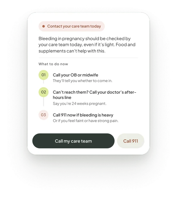
Contact your care team todayFor bleeding, steps and a Call 911 button.
When a pregnancy ends
Edge cases were handled even when tough. The stage screen says “My pregnancy has ended” and “You don’t need to tell us why.”
Weekly updates stop and nothing is deleted. The home switches to nutrition only, and the pregnancy’s photos, milestones and weekly updates move to a private folder in the journal.
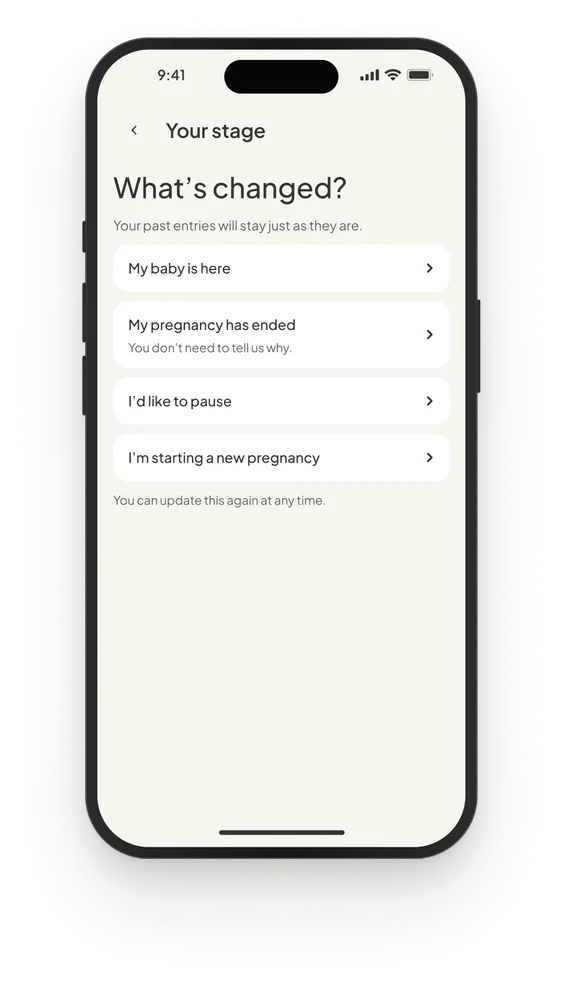
Stage changeYour past entries stay just as they are.
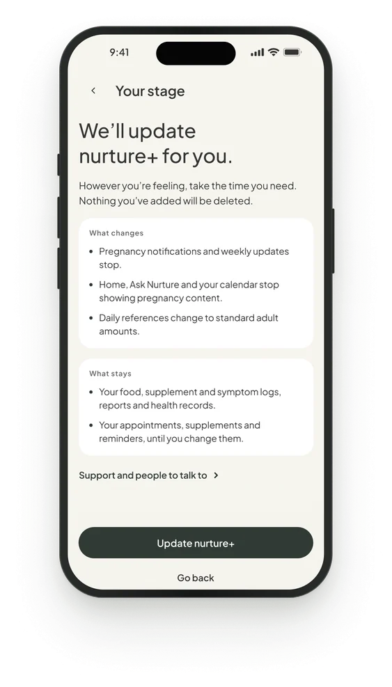
Pregnancy endedWeekly updates stop and nothing is deleted.
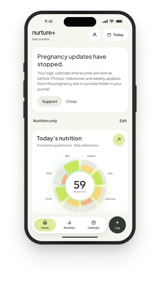
Home afterwardsPregnancy updates stopped, nutrition only.
Food versus prenatal
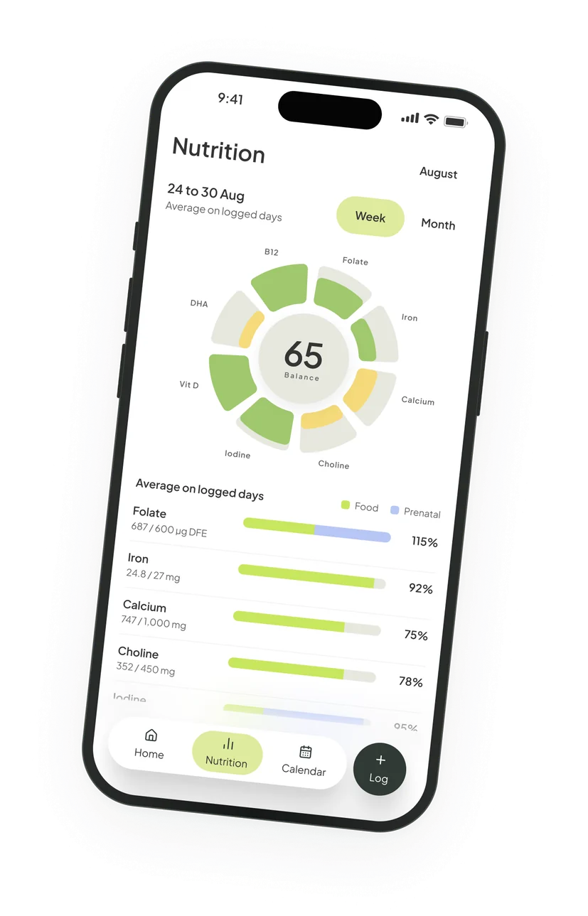
I added another layer to the analytics: food and prenatal nutrition are kept distinct.
The week view averages the days you logged and splits each bar between food and the prenatal. The idea is for the user to know clearly how much nutrition comes from whole foods and how much from supplements, so they can adjust their diet.
Design system
The system uses Geom for display and Plus Jakarta Sans for titles, subtitles and body. The dial and cards follow a 4 point corner radius system.
Two of my notes on the nature board were “Nature + numerics” and “Organic rounded shapes”. You can see them in the balance dial, which puts eight nutrients on petals around one score, and in the pill buttons and circular food photos. This was my attempt at bringing nature into nurture.
 Nutrient petalsNature + numericsPeach for low nutrientsMuted safe color schemeCircular food photosOrganic rounded shapes
- Nutrient petalsNature + numerics
- Peach for low nutrientsMuted safe color scheme
- Circular food photosOrganic rounded shapes
| Geom | |||
|---|---|---|---|
| 24 | Display | Medium | 88/90 |
| 65 | Score | Medium | 40/40 |
| 80 mg | Metric | Medium | 28/36 |
| nurture+ | Wordmark | Medium | 23/28 |
| Plus Jakarta Sans | |||
| Check your inbox | Question | Medium | 32/40 |
| 24 weeks pregnant | Title | SemiBold | 26/34 |
| Today’s deck | Section | SemiBold | 21/28 |
| Create account | Body strong | SemiBold | 15/23 |
| Estimated due date | Body | Regular | 15/23 |
| Welcome | Label | SemiBold | 13/20 |
| Lentils | Caption | Regular | 12/18 |
| Your baby | Micro | SemiBold | 10/14 |
- Cream#f6f5ef
- White#ffffff
- Line#e6e8df
- Lime soft#ddeb9d
- Food#6e8b3d
- On trackLime#c8e75e
- Getting thereYellow#f5da7a
- LowPeach#f6b48a
- Grey#626262
- Text#343434
- Ink#303a35
Food imagery
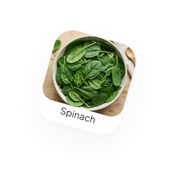
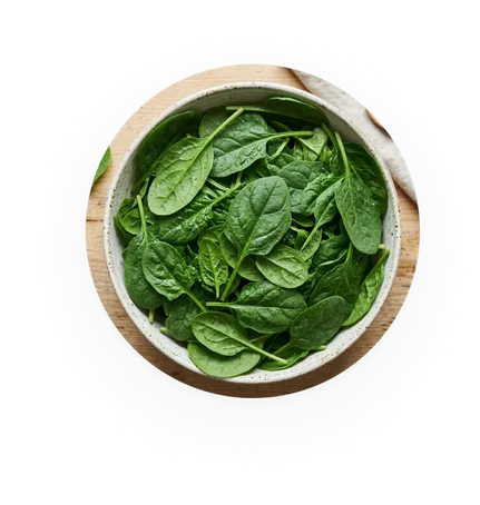
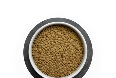
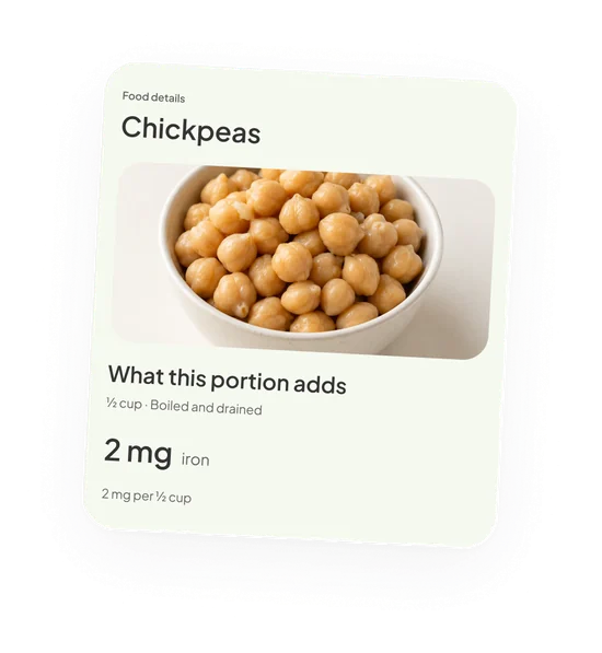
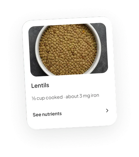
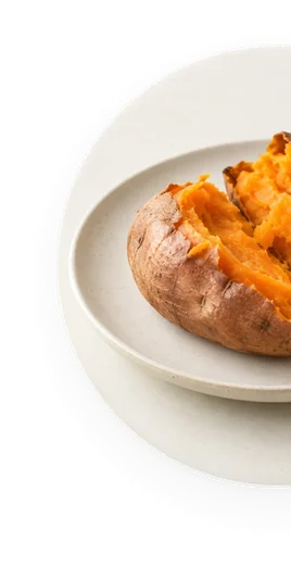
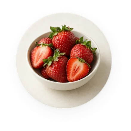
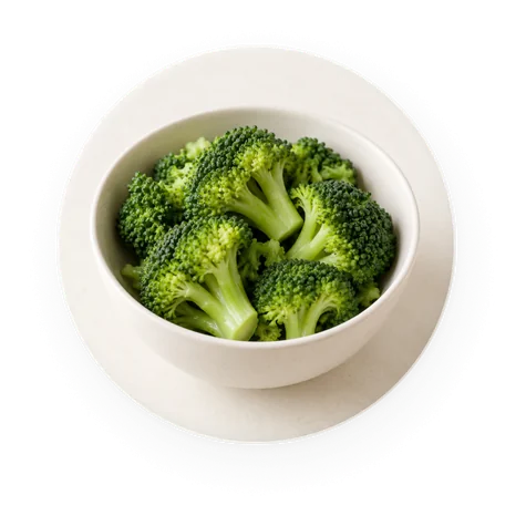
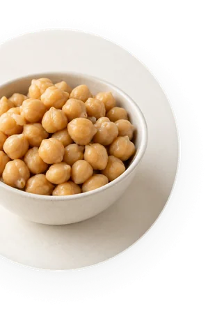
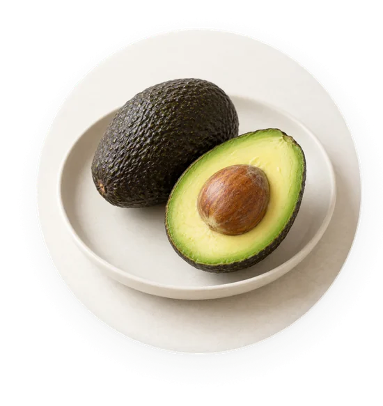
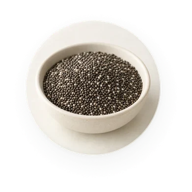
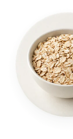
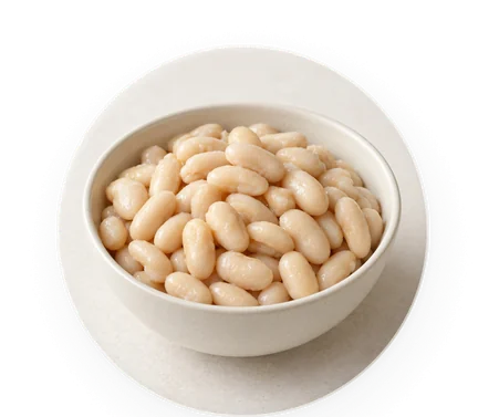
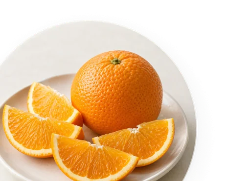
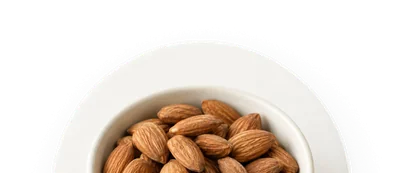
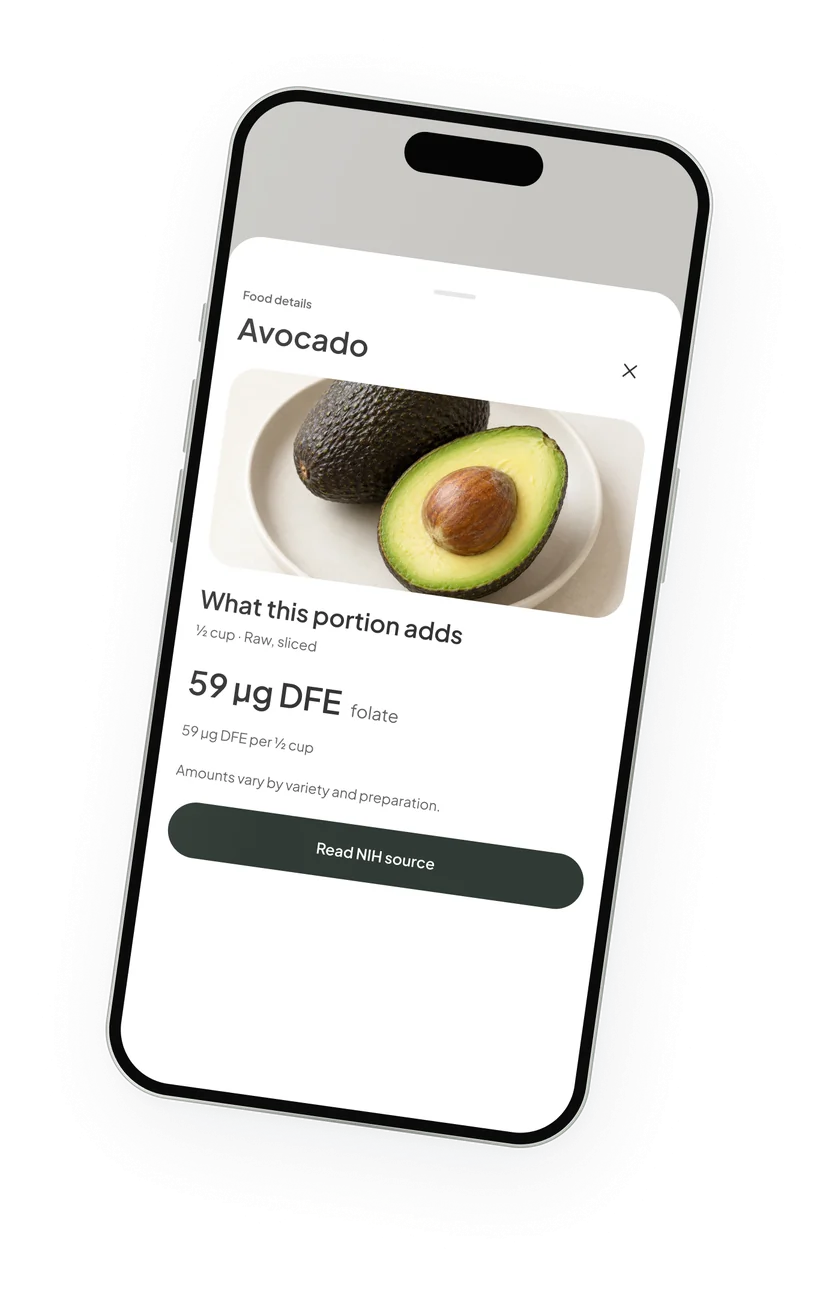
I kept the food photos to one style. Each shot is angled from above on the same pale backdrop.
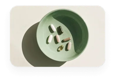
That style comes from my nature moodboard, where a bowl of capsules is shot from above. The idea is to focus on one item, and one item only.
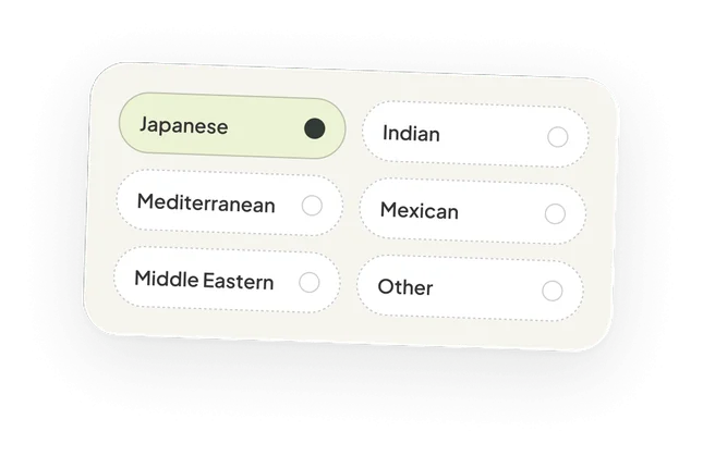
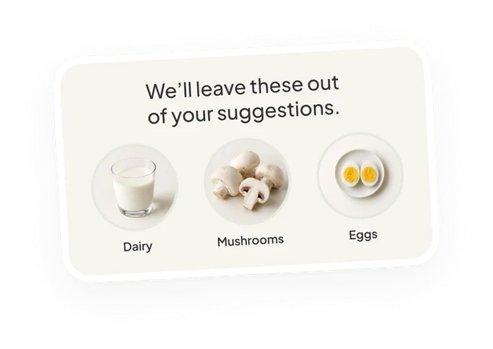
Culture and food preferences
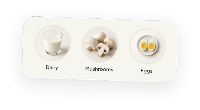
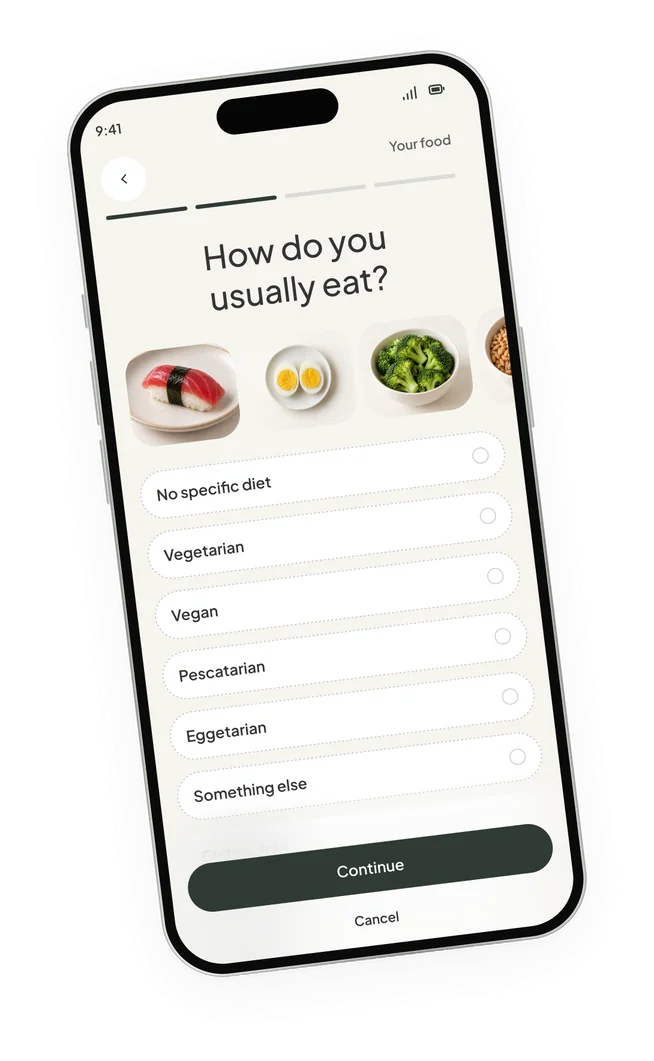
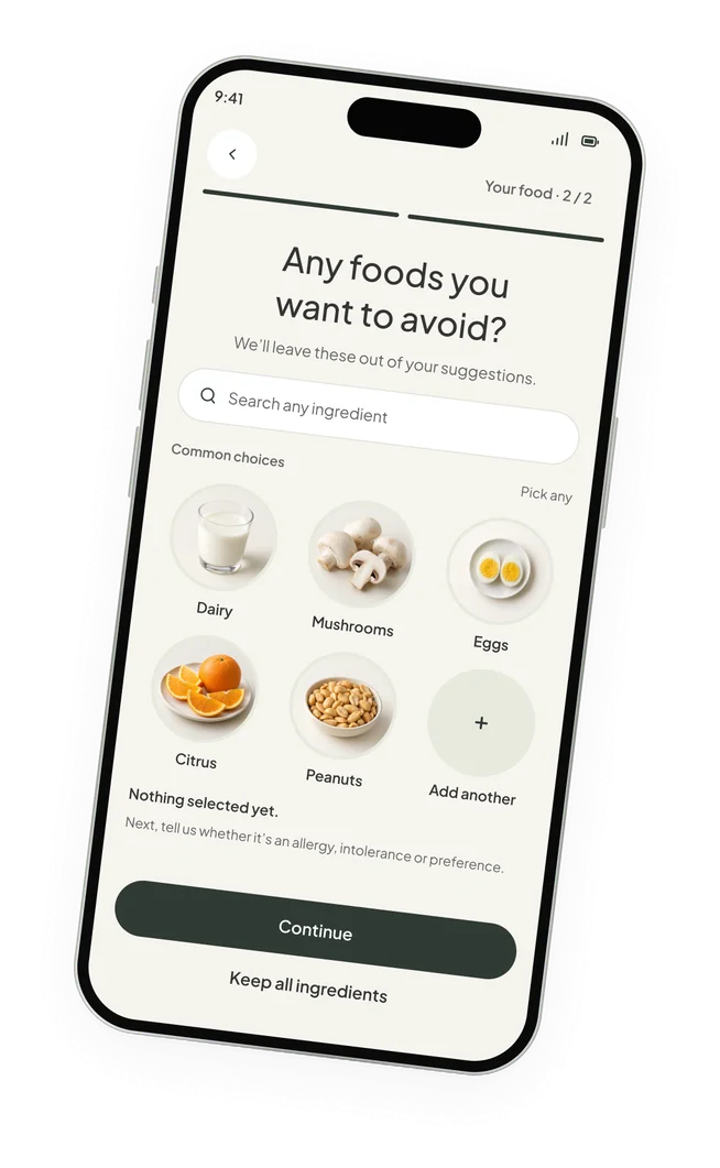
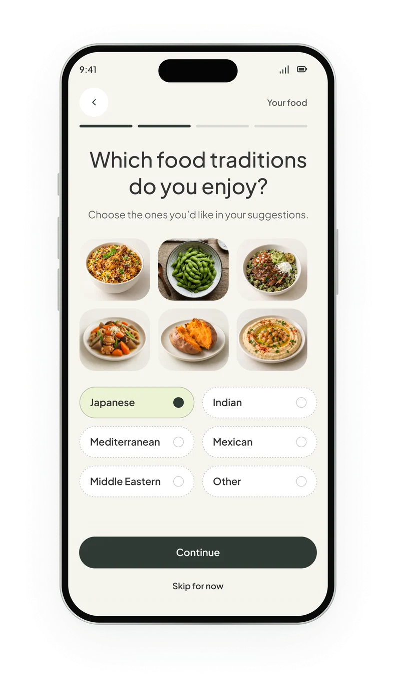
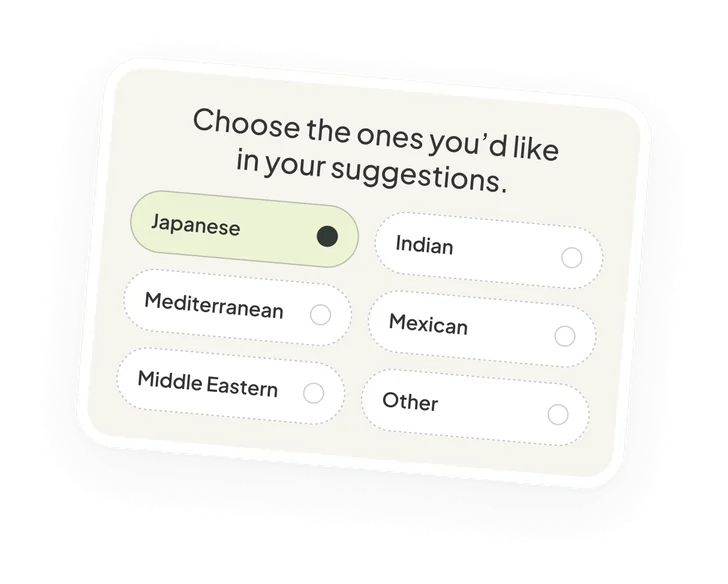
And culture and food preferences weren’t forgotten. All suggestions respect the user’s cultural inclination.
Wrapping up
The project wrapped up after four weeks, and it was one of the most exciting app projects I’ve worked on. Terry had something to say about it:
Raksha was just a pleasure to work with. She is professional, articulate, and is clear about her deliverables and her timeline and sticks to it. She is creative and manages her time well, and communicates everything. As someone who is not well versed in user workflow, she helped guide me through and is knowledgeable about the whole process and provides recommendations after doing diligent research. I can’t wait to work with her again.
See the app at nurtureplus.app, or visit raksha.design to see more of my work.