







A privacy-first period companion
Ova is a privacy-first, PG-13+ period-tracking app designed for women of all ages. It helps people track their cycles, understand patterns, and receive predictive feedback about upcoming periods, symptoms, and moods.
At the centre of the experience is Ova, a warm period companion designed to guide users through their reproductive journey without making the product feel clinical or overly analytical.
- Product strategy, vision, and UX: 2 weeks
- UI design and handover: 2 weeks
When Hannah approached me, she was clear about the opportunity: a privacy-first, teenage-friendly period-tracking app. Her frustration came from products that felt too explicit or unfriendly for younger users, while also sharing personal data in ways that weakened trust.
Hannah had already built consumer apps on Base and planned to bring Ova under her parent company, Cryptiq, beginning with an early-user beta. I connected with the vision immediately, and we started the project on the day of our first call.
Researching the category
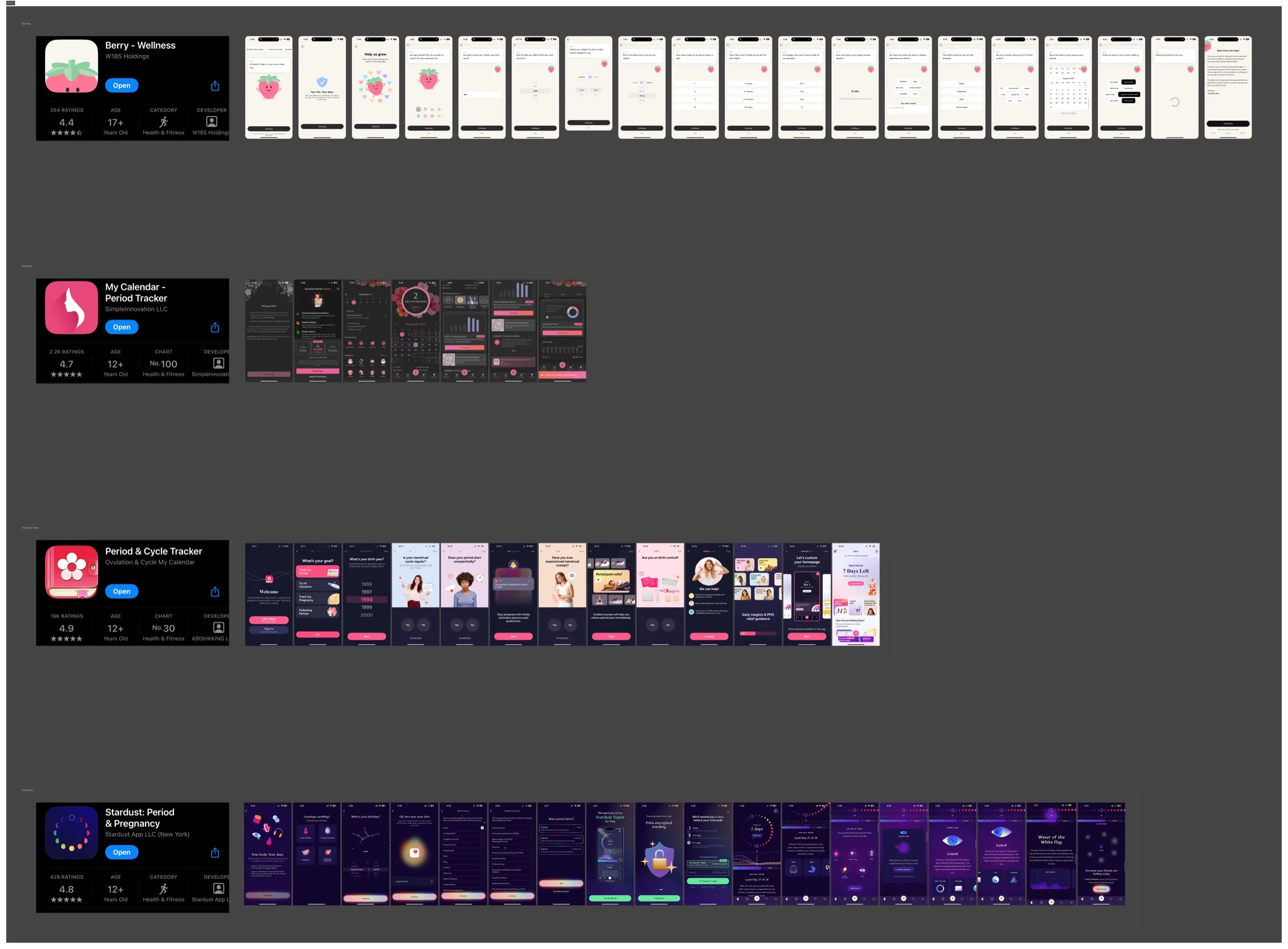
To understand the brief and the frustrations behind it, I studied period-tracking products already in the market. Major competitors such as Flo demonstrated clear demand, but the research also revealed space for a warmer and more age-inclusive experience.
Because Ova was a 0→1 product, I began with competitor analysis and created a PRD that outlined the features relevant to the product we were building.
The research made four product principles clear:
- The app needed to feel warm rather than analytical.
- It needed an educational layer. Not everyone knows what the luteal phase or ovulation means, so the product should help users understand their bodies as they track them.
- Users needed clear reassurance that their data was encrypted.
- A companion filled an emotional gap in the category and aligned with the growing interest in AI companions in the US.
Finding the visual direction
The first direction, Digital Confection, was bright, colourful, approachable, sweet, new-school, and feminine. It positioned Ova as fun, lightly gamified, and holistic. It covered not only cycles, but also symptoms and cravings. Its visual language aligned naturally with the younger audience.

The second direction, Warm Constructivism, was grown-up, sophisticated, subtle, feminine, and grounded. Natural tones such as clay, skin, and peach created warmth and depth, while structured shapes kept the system sharp and modern. It was less playful and more tactile, confident, and expressive.

Digital Confection won. The aim was to serve a broader age range rather than only adults, and its approachable energy gave the product more room to connect with younger users.
Designing the Ova companion
We knew Ova needed to work as a companion without becoming a complex, fully illustrated character. I began with loose digital sketches. Some were intentionally silly. I wanted to find something minimal, cute, and relatable.

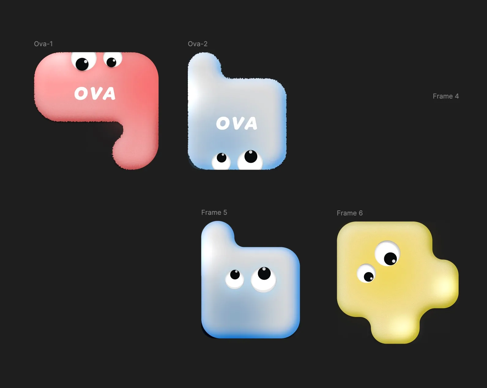
The final direction was selected because it resembled an egg, or ova. The character felt youthful, curious, and visually simple, while its colours kept it connected to the Digital Confection system.
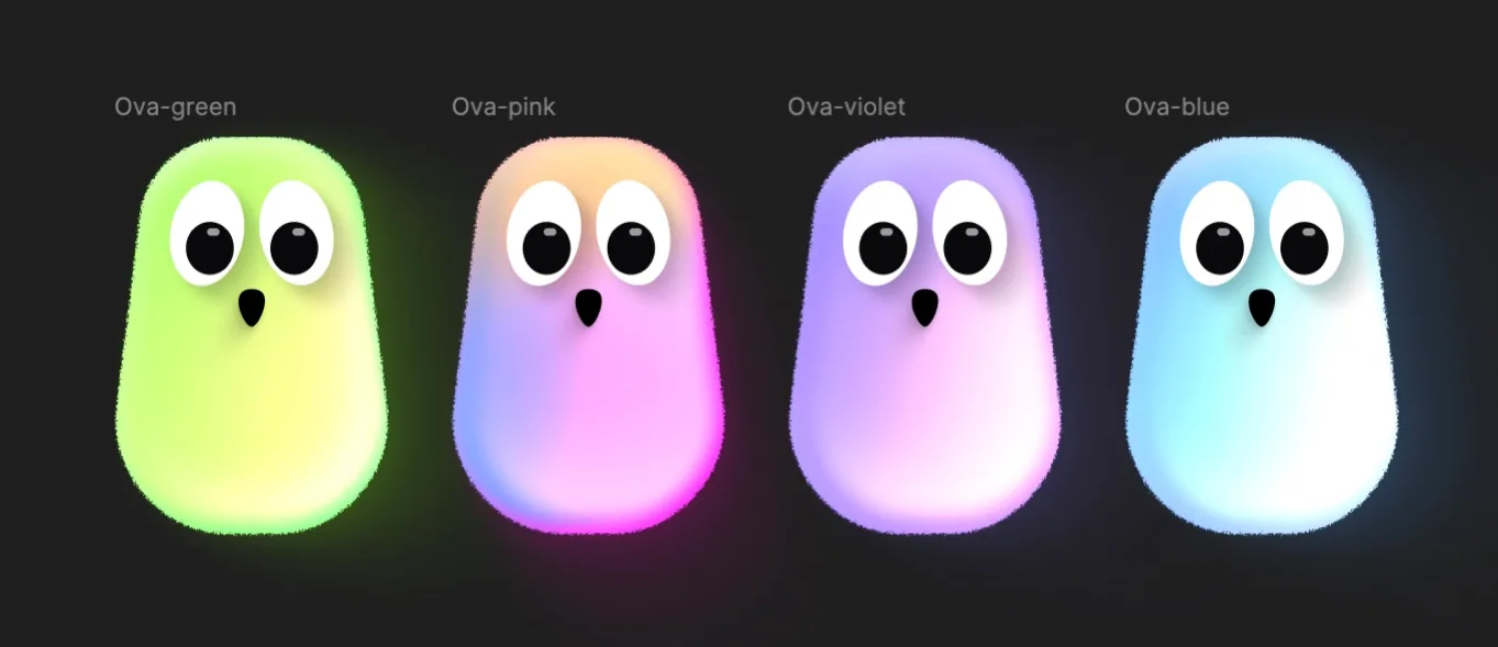
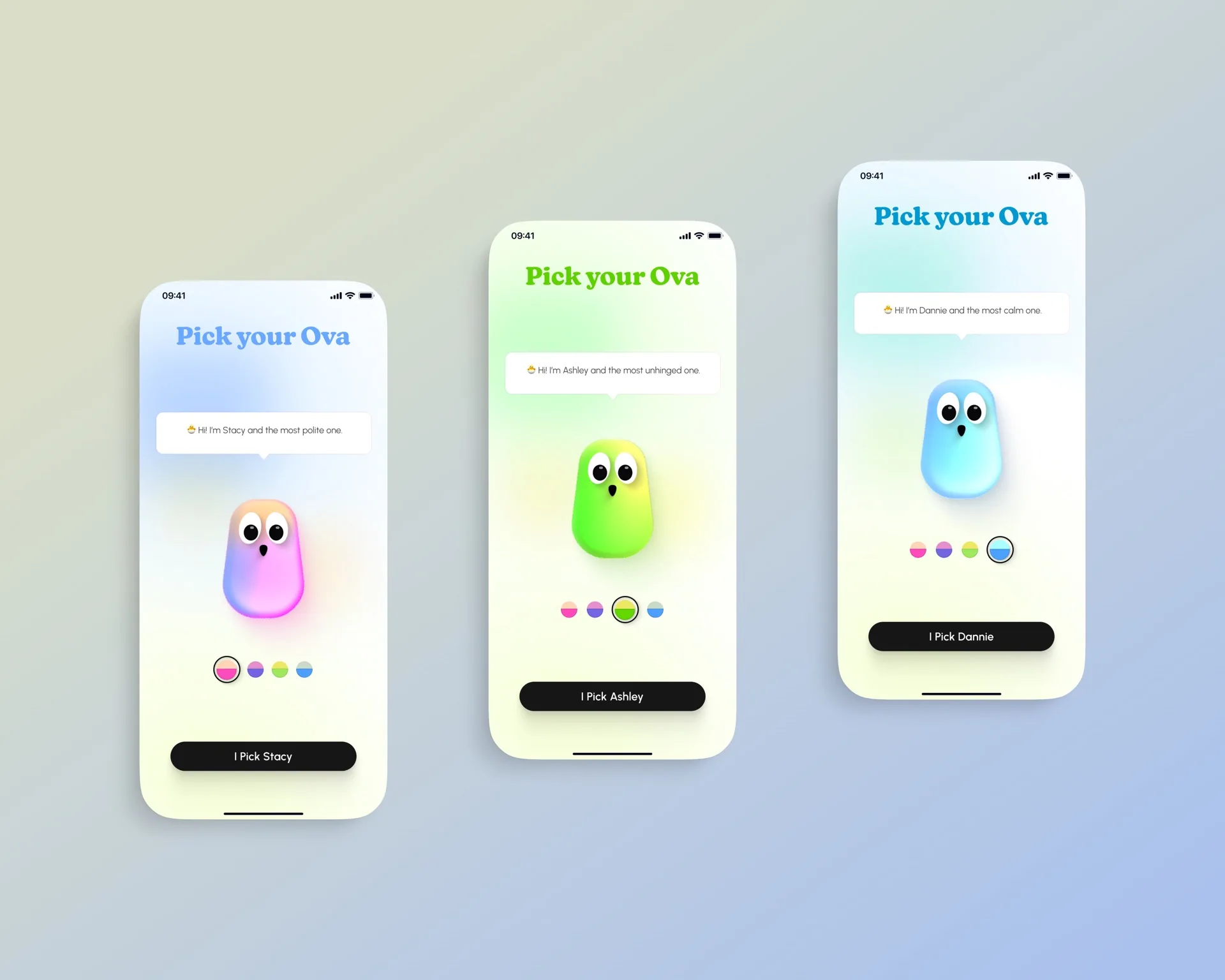
During onboarding, users could choose the Ova they wanted. Each companion had a unique colour combination, name, and personality, allowing people to pick the tone they felt most comfortable with.
Onboarding around trust and context
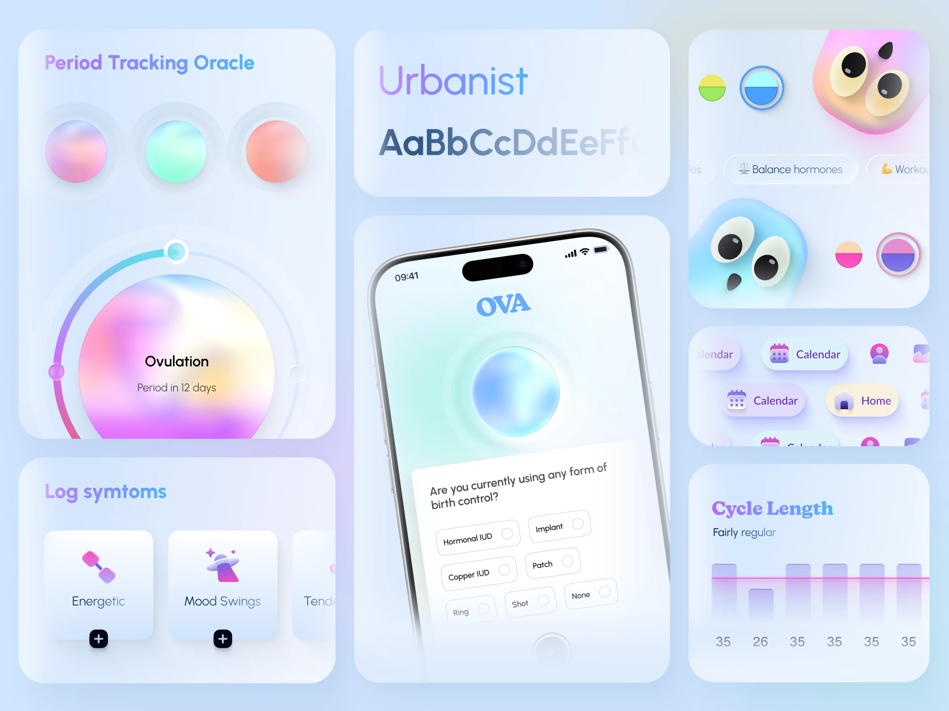
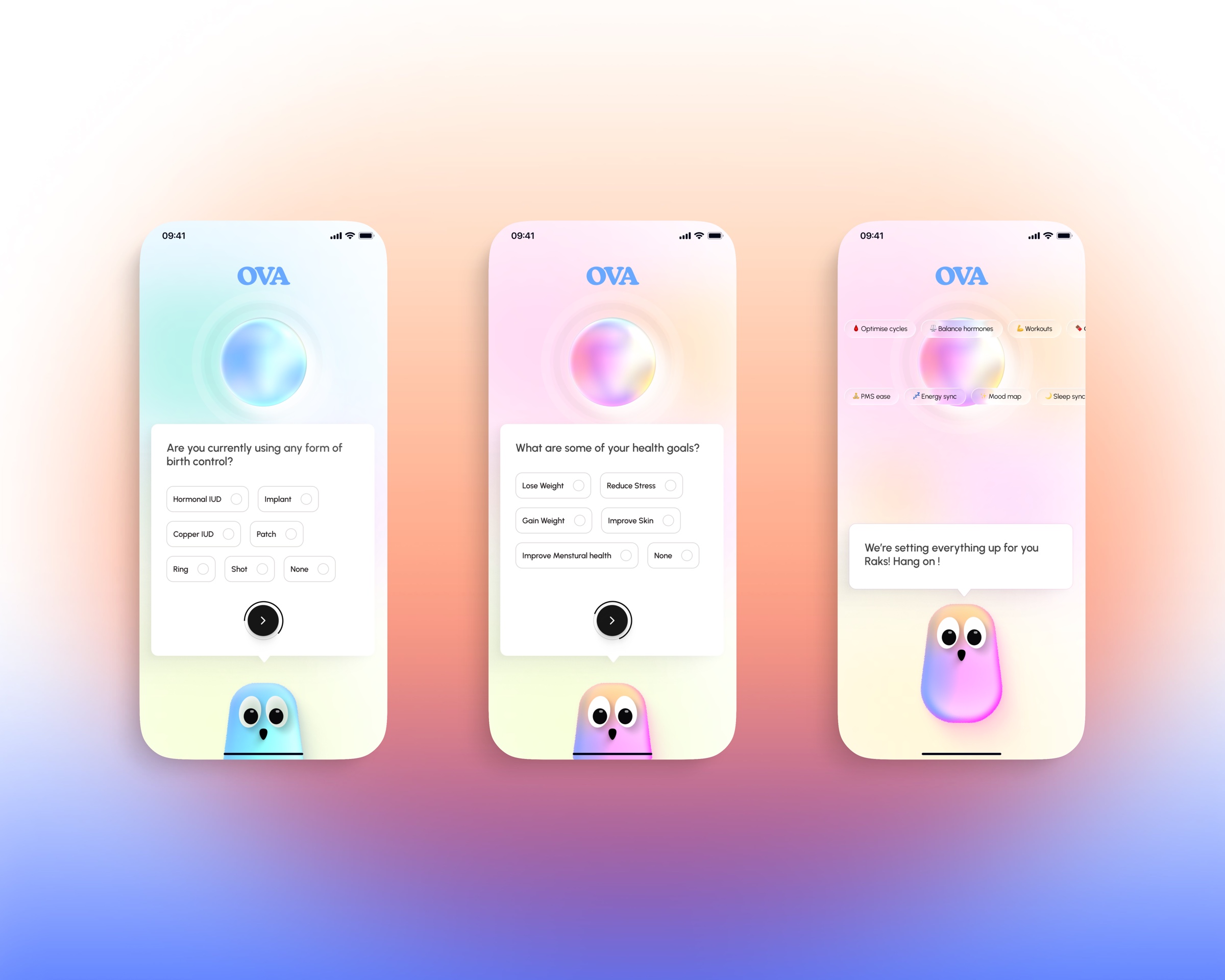
Onboarding asked users a concise set of important questions about hormonal health, birth control, and personal goals. These answers helped the app adapt its guidance to each person’s needs while making the purpose of the questions clear.
The core experience
The Oracle showed users their current cycle status, supported symptom and period logging, and used those inputs to improve predictions for future cycles, symptoms, and overall cycle health.
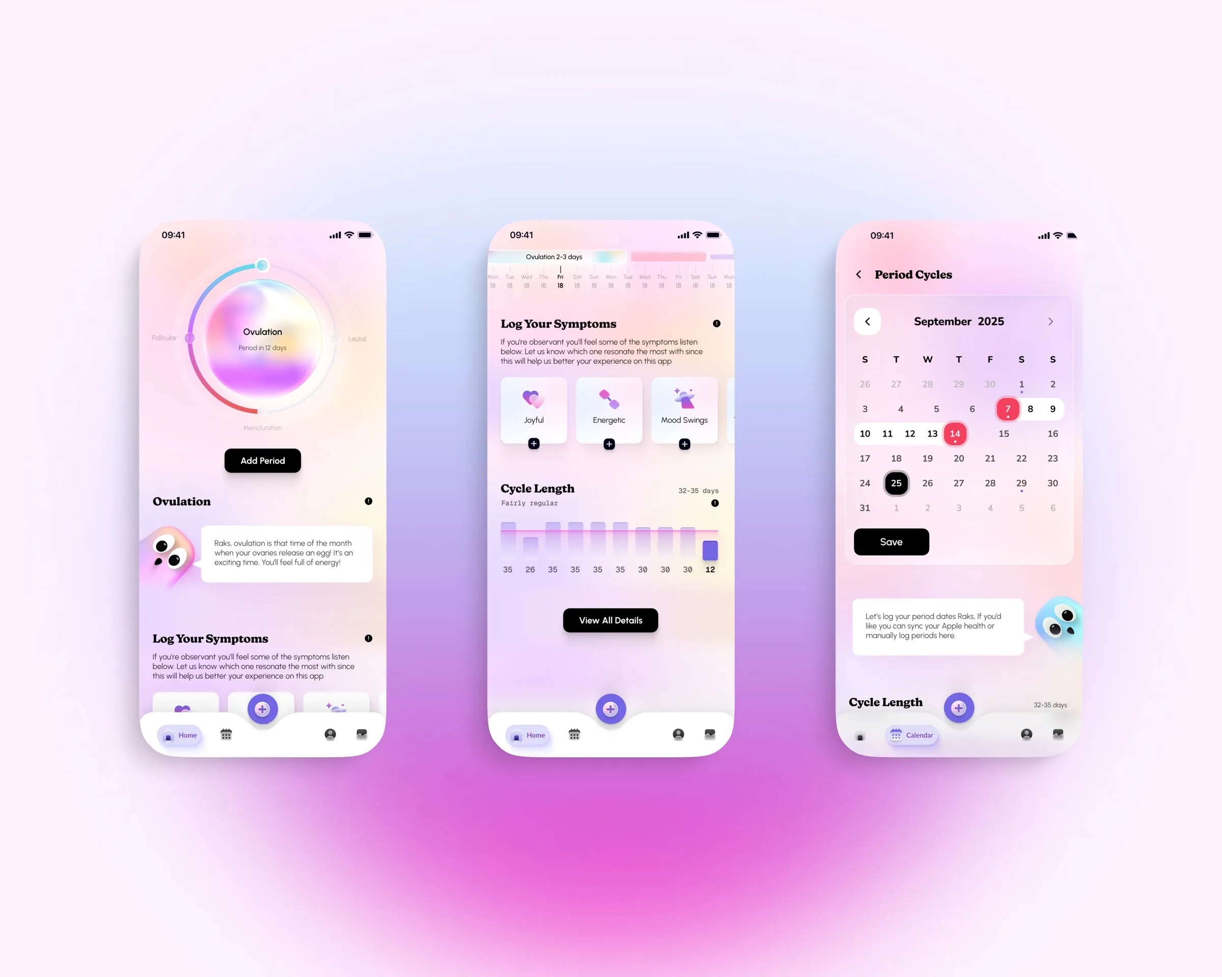
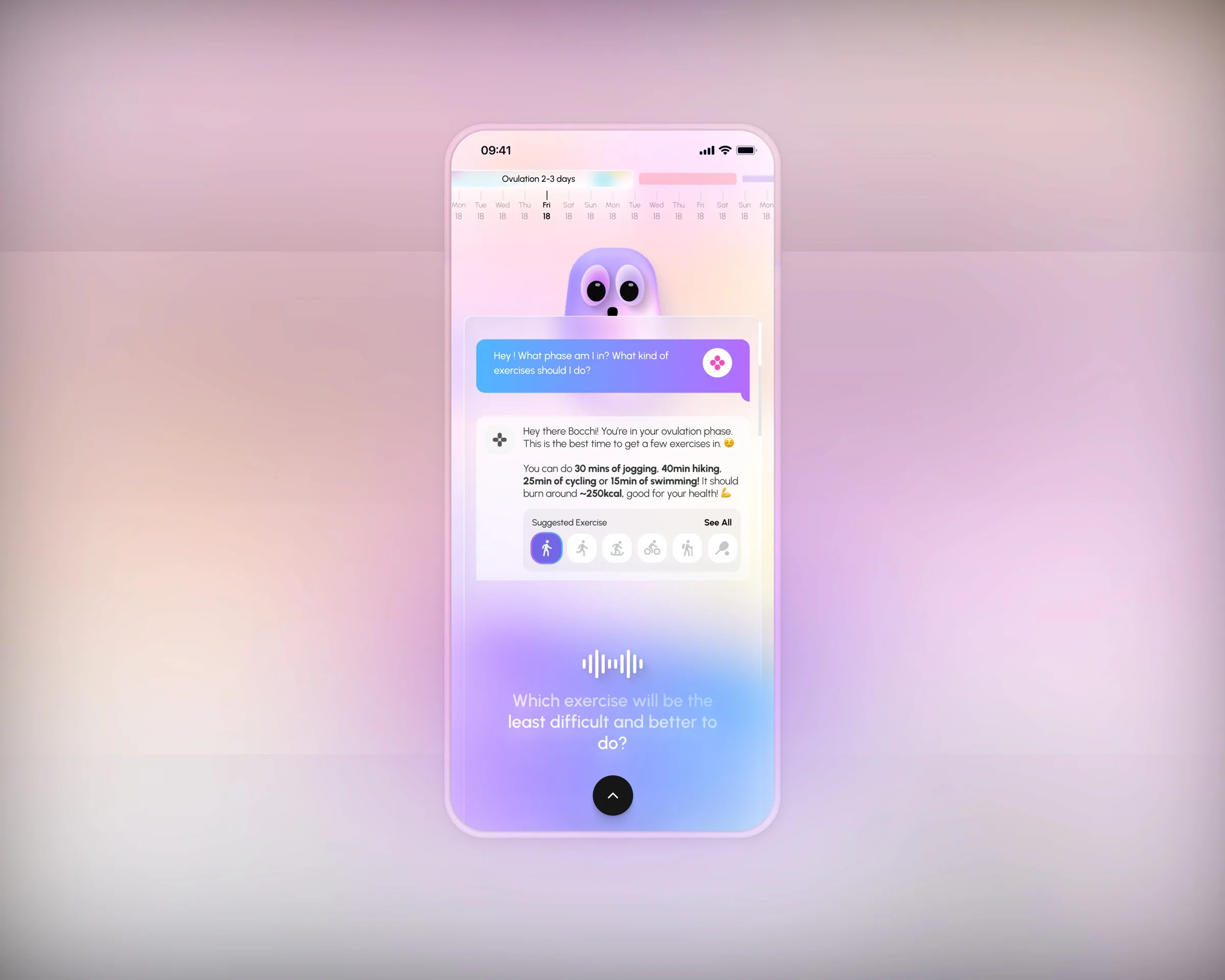
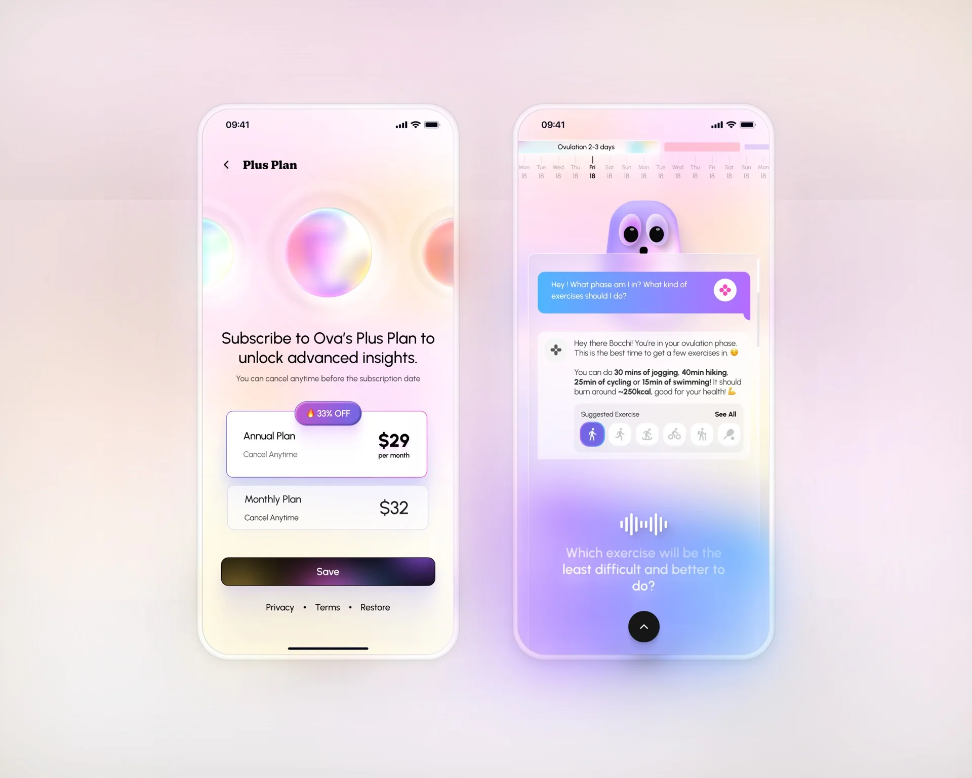
A paid plan also introduced personalised conversations with Ova. Users could ask questions and receive recommendations, with voice-enabled chat considered as a more convenient way to interact.
Preparing the beta
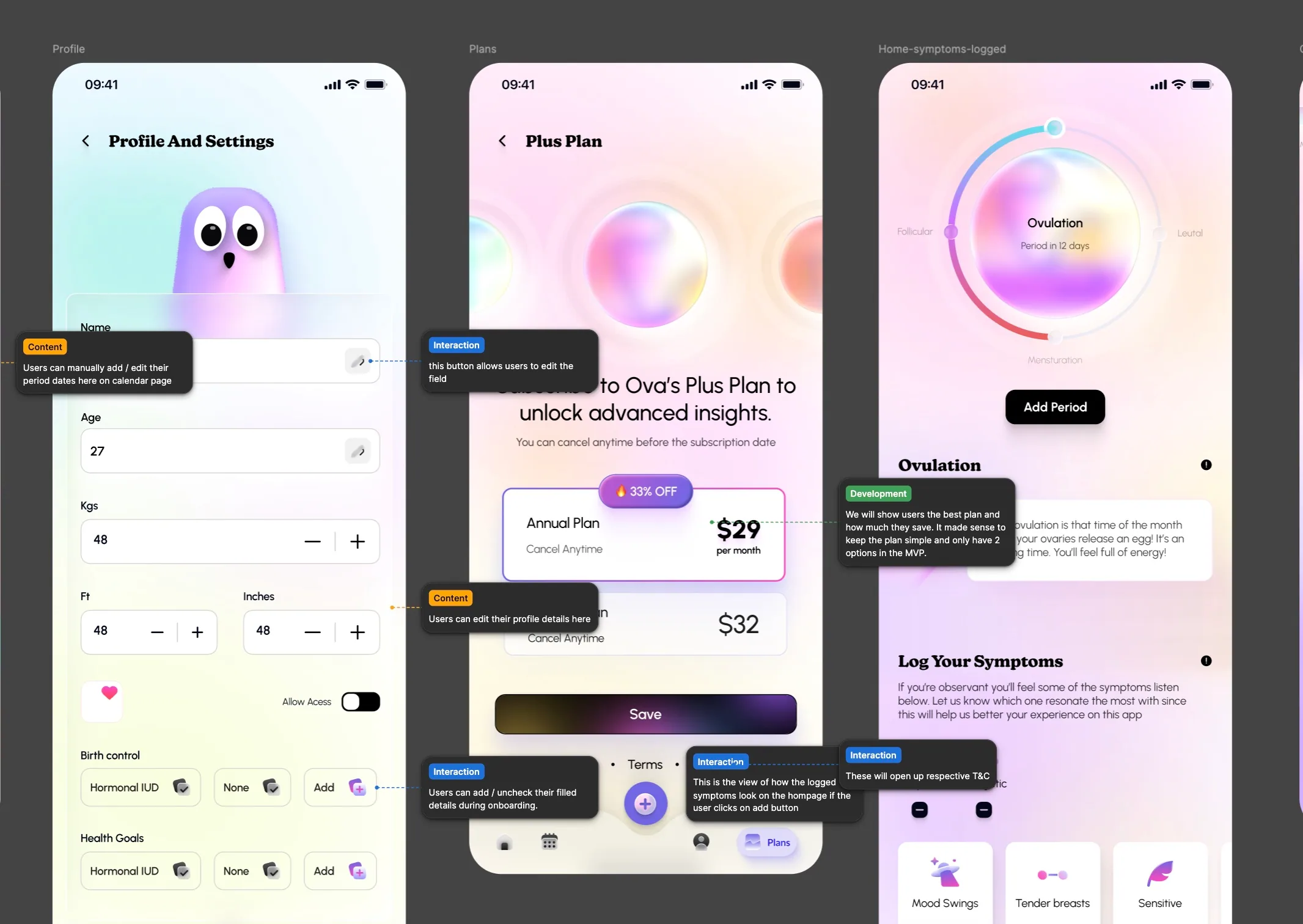
The beta was planned for release on Base, followed by iOS and Android releases after early-user feedback. For handover, I organised development annotations into three clear buckets: interaction, content, and development.
This was my 0→1 journey building Ova with Hannah. Follow the parent company, Cryptiq, for updates on the early release, or visit raksha.design to see more of my work.